【python绘图】matplotlib+seaborn+pyecharts学习过程中遇到的好看的绘图技巧(超实用!)(持续更新中!)
目录
- 一些必要的库
- 一些写的还不错的博客
- 按照图像类型
- 扇形图——可视化样本占比
- 散点图——绘制双/多变量分布
- 1. 二维散点图
- 2. seaborn的jointplot绘制
- 3. seaborn的jointplot绘制(等高线牛逼版)
- 组合点阵图
- sns.pairplot
- 叠加图Area Plot
- 按照功能
- 绘制混淆矩阵
- 绘制ROC&PR曲线(无敌)
一直以来对matplotlib以及seaborn的学习都停留在复制与粘贴与调参,因此下定决心整理一套适合自己的绘图模板以及匹配特定的应用场景,便于自己的查找与更新
目的:抛弃繁杂的参数设置学习,直接看齐优秀的模板
一些必要的库
import matplotlib.pyplot as plt
import seaborn as sns
一些写的还不错的博客
解释plt.plot(),plt.scatter(),plt.legend参数
seaborn.set()
按照图像类型
扇形图——可视化样本占比
散点图——绘制双/多变量分布
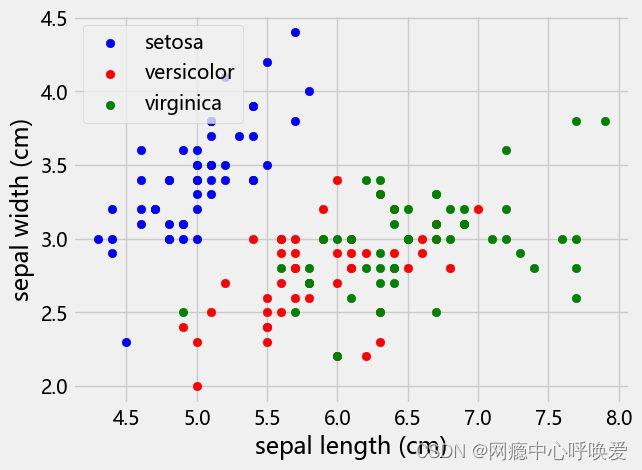
1. 二维散点图
#画散点图,第一维的数据作为x轴和第二维的数据作为y轴
# iris.target_names = array(['setosa', 'versicolor', 'virginica'], dtype='<U10')
x_index=0
y_index=1
colors=['blue','red','green'] # 颜色可调换, 与类别数量相匹配
for label,color in zip(range(len(iris.target_names)),colors):
    plt.scatter(iris.data[iris.target==label,x_index], # 横坐标数据来源
                iris.data[iris.target==label,y_index], # 纵坐标数据来源
                label=iris.target_names[label], # 这里的label即iris.target_names的index: 0,1,2
                c=color) # 颜色参数
plt.xlabel(iris.feature_names[x_index]) # 横坐标的label
plt.ylabel(iris.feature_names[y_index]) # 纵坐标的label
plt.legend(loc='upper left') # 设置图例的位置
plt.show()
数据集为鸢尾花,效果如下:
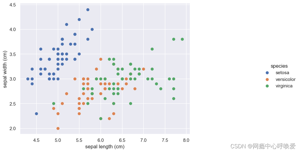
seaborn版本
sns.set(style="darkgrid")# 添加背景
chart = sns.FacetGrid(iris_df, hue="species") .map(plt.scatter, "sepal length (cm)", "sepal width (cm)") .add_legend()
chart.fig.set_size_inches(12,6)
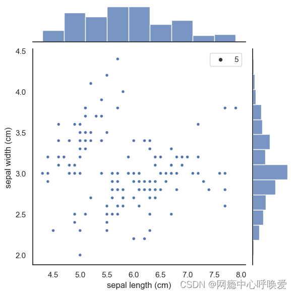
2. seaborn的jointplot绘制
sns.set(style="white", color_codes=True)
sns.jointplot(x="sepal length (cm)", y="sepal width (cm)", data=iris_df, size=5)
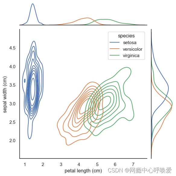
3. seaborn的jointplot绘制(等高线牛逼版)
# 没加阴影
sns.set(style="white", color_codes=True)
sns.jointplot(x='petal length (cm)', y='sepal width (cm)',data= iris_df,
              kind="kde",
              hue='species' # 按照鸢尾花的类别进行了颜色区分
)
plt.show()
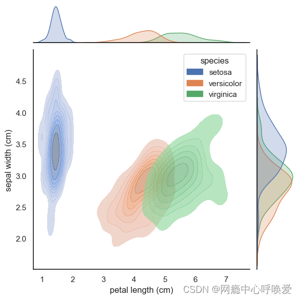
sns.jointplot(x='petal length (cm)', y='sepal width (cm)',data= iris_df,
              kind="kde",
              hue='species',
              joint_kws=dict(alpha =0.6,shade = True,),
              marginal_kws=dict(shade=True)
)
参考文章
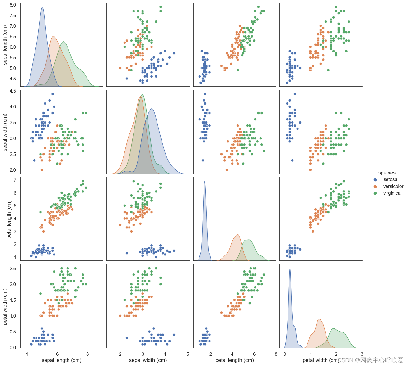
组合点阵图
sns.pairplot
sns.pairplot(iris_df, hue="species", size=3)
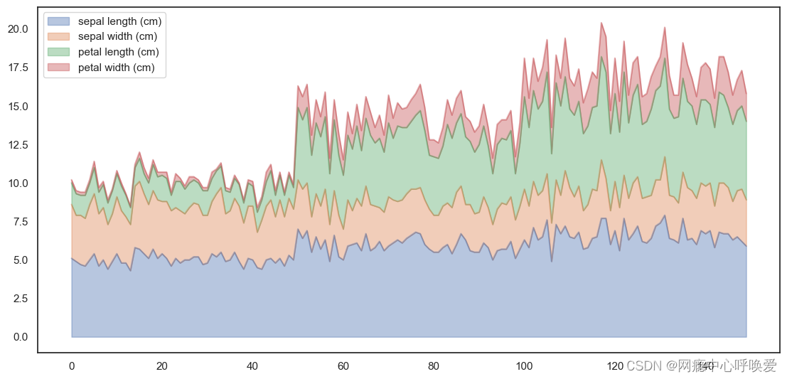
叠加图Area Plot
iris_df.plot.area(y=['sepal length (cm)', 'sepal width (cm)', 'petal length (cm)', 'petal width
(cm)'],alpha=0.4,figsize=(12, 6));
按照功能
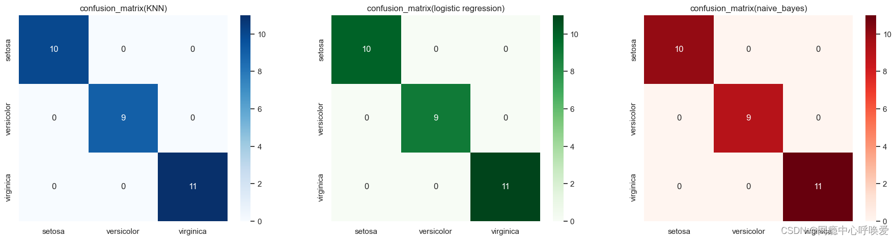
绘制混淆矩阵
其实就是热力图:
y_pred_grid_knn = knn_grid_search.predict(X_test)
y_pred_grid_logi = logistic_grid_search.predict(X_test)
y_pred_grid_nb = naive_bayes.predict(X_test)

matrix_1 = confusion_matrix(y_test, y_pred_grid_knn)
matrix_2 = confusion_matrix(y_test, y_pred_grid_logi)
matrix_3 = confusion_matrix(y_test, y_pred_grid_nb)

df_1 = pd.DataFrame(matrix_1,
                     index = ['setosa','versicolor','virginica'],
                     columns = ['setosa','versicolor','virginica'])

df_2 = pd.DataFrame(matrix_2,
                     index = ['setosa','versicolor','virginica'],
                     columns = ['setosa','versicolor','virginica'])

df_3 = pd.DataFrame(matrix_3,
                     index = ['setosa','versicolor','virginica'],
                     columns = ['setosa','versicolor','virginica'])
plt.figure(figsize=(20,5))
plt.subplots_adjust(hspace = .25)
plt.subplot(1,3,1)
plt.title('confusion_matrix(KNN)')
sns.heatmap(df_1, annot=True,cmap='Blues')
plt.subplot(1,3,2)
plt.title('confusion_matrix(logistic regression)')
sns.heatmap(df_2, annot=True,cmap='Greens')
plt.subplot(1,3,3)
plt.title('confusion_matrix(naive_bayes)')
sns.heatmap(df_3, annot=True,cmap='Reds')
plt.show()
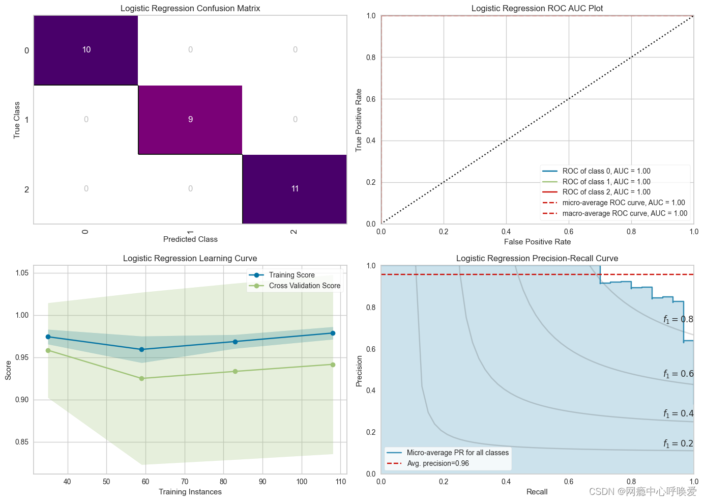
绘制ROC&PR曲线(无敌)
在kaggle 偶然看到的,这也太好看了,用到了yellowbrick这个库
from yellowbrick.classifier import PrecisionRecallCurve, ROCAUC, ConfusionMatrix
from yellowbrick.style import set_palette
from yellowbrick.cluster import KElbowVisualizer
from yellowbrick.model_selection import LearningCurve, FeatureImportances
from yellowbrick.contrib.wrapper import wrap

# --- LR Accuracy ---
LRAcc = accuracy_score(y_pred_grid_logi, y_test)
print('.:. Logistic Regression Accuracy:'+'\033[35m\033[1m {:.2f}%'.format(LRAcc*100)+' \033[0m.:.')

# --- LR Classification Report ---
print('\033[35m\033[1m\n.: Classification Report'+'\033[0m')
print('*' * 25)
print(classification_report(y_test, y_pred_grid_logi))

# --- Performance Evaluation ---
print('\033[35m\n\033[1m'+'.: Performance Evaluation'+'\033[0m')
print('*' * 26)
fig, ((ax1, ax2), (ax3, ax4)) = plt.subplots(2, 2, figsize = (14, 12))

#--- LR Confusion Matrix ---
logmatrix = ConfusionMatrix(logistic_grid_search, ax=ax1, cmap='RdPu', title='Logistic Regression Confusion Matrix')
logmatrix.fit(X_train, y_train)
logmatrix.score(X_test, y_test)
logmatrix.finalize()

# --- LR ROC AUC ---
logrocauc = ROCAUC(logistic_grid_search, ax = ax2, title = 'Logistic Regression ROC AUC Plot')
logrocauc.fit(X_train, y_train)
logrocauc.score(X_test, y_test)
logrocauc.finalize()

# --- LR Learning Curve ---
loglc = LearningCurve(logistic_grid_search, ax = ax3, title = 'Logistic Regression Learning Curve')
loglc.fit(X_train, y_train)
loglc.finalize()

# --- LR Precision Recall Curve ---
logcurve = PrecisionRecallCurve(logistic_grid_search, ax = ax4, ap_score = True, iso_f1_curves = True,
                                title = 'Logistic Regression Precision-Recall Curve')
logcurve.fit(X_train, y_train)
logcurve.score(X_test, y_test)
logcurve.finalize()

plt.tight_layout();