css-边框流水线
效果图:
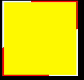
代码:
<!DOCTYPE html>
<html>
	<head>
		<meta charset="utf-8">
		<meta name="viewport" content="initial-scale=1.0, user-scalable=no" />
		<title></title>
		<style type="text/css">
			.card{
				z-index: 1;
				width: 250px;
				height: 250px;
				background-color: aliceblue;
				position: relative;
				overflow: hidden;
			}

			.bg{
				z-index: 3;
				width: 240px;
				height: 240px;
				background-color: yellow;
				position: absolute;
				left: 5px;
				top: 5px;
			}
			.blob2{
				z-index: 2;
				width: 250px;
				height: 250px;
				position: absolute;
				left: -50%;
				top: -50%;
				border-radius: 50%;
				background-color: red;
				transform-origin: right bottom;
				animation: scanning 5s linear infinite;
			}
			.blob{
				z-index: 2;
				width: 250px;
				height: 250px;
				position: absolute;
				left: 50%;
				top: 50%;
				border-radius: 50%;
				background-color: red;
				transform-origin: left top;
				animation: scanning 5s linear infinite;
			}
			@keyframes scanning{
				to{
					transform: rotate(360deg);
				}
			}
		</style>
	</head>
	<body
		style="background-color: black;">
		<div class="card">
			<div class="bg"></div>
			<div class="blob"></div>
			<div class="blob2"></div>
		</div>
	</body>
</html>
效果图
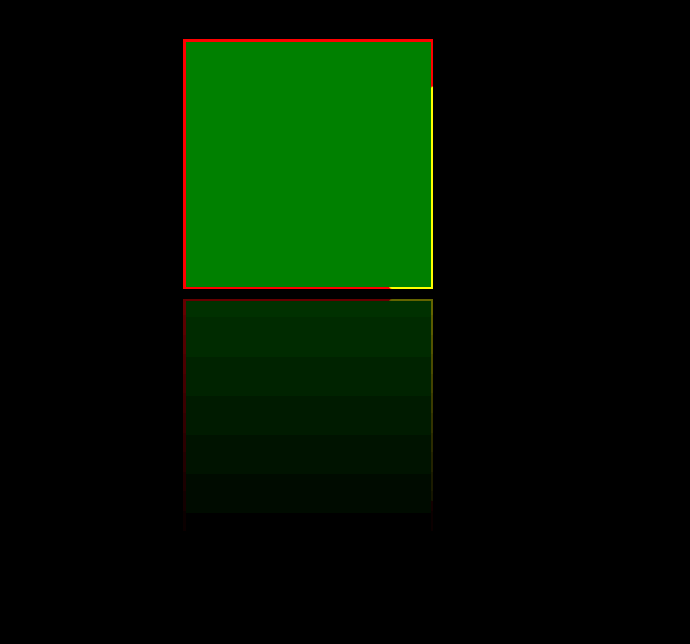
代码:
<!DOCTYPE html>
<html>
	<head>
		<meta charset="utf-8">
		<title></title>
	</head>
	<body>
		<style>
			*{
				margin: 0;
				padding: 0;

			}
			 body{
				 background-color: black;
			 }
			.container{
				width: 100vw;
				height: 100vh;
				backdrop-filter: blur(50px);
				display: flex;
				justify-content: center;
			}
			.box{
				z-index: 1;
				width: 250px;
				box-sizing: border-box;
				height: 250px;
				margin: 50px;
				background-color: red;
				position: relative;
				overflow: hidden;
				-webkit-box-reflect: below 10px linear-gradient(to bottom, rgba(0,0,0,0), rgba(0,0,0,0.4));

			}
			:root{
				--wi:5px;
				--hi:5px;
			}
			.rect_out{
				z-index: 3;
				position: absolute;
				width: calc(100% - var(--wi));
				height: calc(100% - var(--hi));
				left: calc(var(--wi)/2);
				top: calc(var(--hi)/2);
				background-color: green;
			}
			.rect_in{
				z-index: 2;
				width: 100%;
				height: 100%;
				background-color: yellow;
				position: absolute;
				left: -50%;
				top: -50%;
				border-radius: 50%;
				transform-origin: right bottom;
			    animation: rotate 5s linear infinite;
			}
			@keyframes rotate{
				from{
					transform: rotate(0deg);
				}

				to{
					transform: rotate(360deg);
				}
			}

		</style>

		<div class="container">
			<div class="box">
				<div class="rect_out"></div>
				<div class="rect_in"></div>
			</div>
		</div>
	</body>
</html>