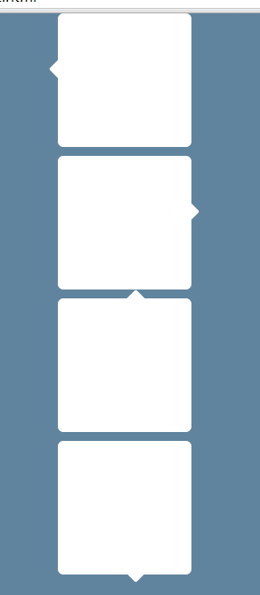
CSS3 提示框带边角popover
CSS3 提示框带边角popover。因为需要绝对定位子元素(这里就是伪元素),所以需要将其设置为相对对位
<!DOCTYPE html>
<html>
<head>
<title>test1.html</title>

<meta name="keywords" content="keyword1,keyword2,keyword3">
<meta name="description" content="this is my page">
<meta name="content-type" content="text/html; charset=UTF-8">


<style type="text/css">
/*多个class是相同的用,分开
 *:单冒号(:)用于CSS3伪类,双冒号(::)用于CSS3伪元素
 *before和after的详解:http://www.w3cplus.com/css3/learning-to-use-the-before-and-after-pseudo-elements-in-css.html
 *box-shadow详解:http://swordair.com/details-on-css3-box-shadow-part-1/
 *http://www.w3cplus.com/blog/tags/11.html
 */

.popover-left,.popover-top,.popover-bottom, .popover-right{
    /*border-style: solid;*/
    border-radius:6px;/*div平滑6个像素*/
    position: relative; /* 因为需要绝对定位子元素(这里就是伪元素),所以需要将其设置为相对对位 */
    background-color: white; /*白色*/
    width: 150px;
    height:150px;
    margin: 10px auto;
}

.popover-left::before{ /* 伪元素其实和普通元素没多大区别 */
    position: absolute; /* 绝对定位 */
    content: ' '; /* 伪元素需要有个content,这里设了一个空格占位 */
    left: -5px; /* 把这个小尖尖突出来 */
    top:50px; /* 往下挪一点点 */
    /**border-bottom-color: #999;
     **border-top-width: 0;
     */
    width: 25px; /* 25x25的一个元素 */
    height: 25px;
    border-radius:2px;/*突出来的角弧度稍微平滑2个像素*/
    background-color: white;
    box-shadow: 6px 5px 2px -9px white, 5px 6px 2px -9px white;/*box-shadow,左上角,右上角,左下角,右下角,白色*/
    /**======兼容浏览器=webkit支持(苹果谷歌等浏览器),moz(火狐),ms(IE浏览器),-o(opera浏览器)====*/
    -webkit-transform: rotate(45deg); /* 旋转45度 */
    -moz-transform:    rotate(45deg);
    -ms-transform:     rotate(45deg);
    -o-transform:      rotate(45deg);
}

.popover-right::after { /* 伪元素其实和普通元素没多大区别 */
    position: absolute; /* 绝对定位 */
    content: ' '; /* 伪元素需要有个content,这里设了一个空格占位 */
    left: 129px; /* 把这个小尖尖突出来 */
    top:50px; /* 往下挪一点点 */

    width: 25px; /* 20x20的一个元素 */
    height: 25px;

    border-radius:2px;/*突出来的角弧度稍微平滑2个像素*/
    background-color: white;
    box-shadow: 6px 5px 2px -9px white, 5px 6px 2px -9px white;/*box-shadow,左上角,右上角,左下角,右下角*/

    -webkit-transform: rotate(45deg); /* 旋转45度 */
    -moz-transform:    rotate(45deg);
    -ms-transform:     rotate(45deg);
    -o-transform:      rotate(45deg);
}

.popover-top:after { /* 伪元素其实和普通元素没多大区别 */
    content: "";
    position: absolute;
    top: -5px;/*角离div的边线-5px这个值越小就会突出这个正方形.*/
    left: 50%;

    width: 25px;
    height: 25px;
    border-radius:2px;/*突出来的角弧度稍微平滑2个像素*/
    background-color: white;
    box-shadow: 6px 5px 2px -9px white, 5px 6px 2px -9px white;/*box-shadow,左上角,右上角,左下角,右下角*/

    -webkit-transform: rotate(45deg);
    -moz-transform:    rotate(45deg);
    -ms-transform:     rotate(45deg);
    -o-transform:      rotate(45deg);
}

.popover-bottom:after { /* 伪元素其实和普通元素没多大区别 */
    content: "";
    position: absolute;
    top: 129px;/*角离div的边线129px这个值越大就会突出这个正方形.*/
    left: 50%;


    width: 25px;
    height: 25px;
    /**border-bottom-color: #999;
     **border-top-width: 0;
     */
    border-radius:2px;/*突出来的角弧度稍微平滑2个像素*/
    background-color: white;
    box-shadow: 6px 5px 2px -9px white, 5px 6px 2px -9px white;/*box-shadow,左上角,右上角,左下角,右下角*/

    -webkit-transform: rotate(45deg);
    -moz-transform:    rotate(45deg);
    -ms-transform:     rotate(45deg);
    -o-transform:      rotate(45deg);
}
</style>
</head>

<body style="background-color: #61849e">

    <div class="popover-left">
    </div>
    <div class="popover-right">
    </div>

    <div class="popover-top">
    </div>

    <div class="popover-bottom">
    </div>
    <br/>


</body>
</html>
<!DOCTYPE html>
<html>
<head>
<title>popover-left,popover-right,popover-top,popover-bottom </title>
<meta name="content-type" content="text/html; charset=UTF-8">
<style type="text/css">
/*
*@Author:liangjilong
*多个class是相同的用,分开
*:单冒号(:)用于CSS3伪类,双冒号(::)用于CSS3伪元素
*box-shadow详解:http://swordair.com/details-on-css3-box-shadow-part-1/
*/
.popover-left,.popover-top,.popover-bottom, .popover-right{
/*border-style: solid;*/
border-radius:6px;/*div平滑6个像素*/
position: relative; /* 因为需要绝对定位子元素(这里就是伪元素),所以需要将其设置为相对对位 */
background-color: white; /*白色*/
width: 150px;
height: 150px;
margin: 10px auto;
}
/**公共的样式**/
.popover-common{
position: absolute; /* 绝对定位 */
/**border-bottom-color: #999;
**border-top-width: 0;
*/
width: 25px; /* 25x25的一个元素 */
height: 25px;
border-radius:2px;/*突出来的角弧度稍微平滑2个像素*/
background-color: white;
box-shadow: 6px 5px 2px -9px white, 5px 6px 2px -9px white;/*box-shadow,左上角,右上角,左下角,右下角,白色*/
/**======兼容浏览器=webkit支持(苹果谷歌等浏览器),moz(火狐),ms(IE浏览器),-o(opera浏览器)====*/
-webkit-transform: rotate(45deg); /* 旋转45度 */
-moz-transform: rotate(45deg);
-ms-transform: rotate(45deg);
-o-transform: rotate(45deg);
}
.popover-left .popover-common{
left: -5px; /* 把这个小尖尖突出来 */
top:50px; /* 往下挪一点点 */
}
.popover-right .popover-common {
left: 129px; /* 把这个小尖尖突出来 */
top:50px; /* 往下挪一点点 */
}
.popover-top .popover-common {
top: -5px;/*角离div的边线-5px这个值越小就会突出这个正方形.*/
left: 50%;
}
.popover-bottom .popover-common {
top: 129px;/*角离div的边线129px这个值越大就会突出这个正方形.*/
left: 50%;
}
</style>
</head>
<body style="background-color: #61849e">
<div class="popover-left">
<div class="popover-common"></div>
</div>
<br/>
<div class="popover-right">
<div class="popover-common"></div>
</div>
<br/>
<div class="popover-top">
<div class="popover-common"></div>
</div>
<br/>
<div class="popover-bottom">
<div class="popover-common"></div>
</div>
<br/>
</body>
</html>