Flutter Column组件实战案例
In this section, we’ll explore the Column widget, a fundamental tool for arranging widgets vertically in Flutter. We’ll dive into its functionality and guide you through using it effectively to create well-organized and visually appealing layouts.
在本节中,我们将探索“Column”小部件,这是在Flutter中垂直排列小部件的基本工具。我们将深入研究它的功能,并指导您有效地使用它来创建组织良好和视觉上吸引人的布局。
Understanding the Column Widget
了解“Column”小部件
The Column widget is designed to arrange its children vertically, one below the other. It’s an excellent choice when you want to create a list of widgets that need to be stacked on top of each other.
“Column”小部件被设计成垂直排列其子组件,一个在另一个的下面。当您想要创建一个需要堆叠在一起的小部件列表时,这是一个很好的选择。
How Does it Work?
它是如何工作的?
A Column can contain multiple child widgets, each of which occupies its designated space within the layout. The column will take the width of its widest child and distribute the available vertical space evenly among its children.
一个“列”可以包含多个子部件,每个子部件在布局中占据其指定的空间。列将取其最宽子的宽度,并将可用的垂直空间均匀地分配给其子。
Why Use Column?
为什么使用“Column”?
The Column widget comes in handy when you need to organize widgets vertically. It’s particularly useful for creating lists, forms, and other components that require a linear arrangement of content.
当你需要垂直组织小部件时,“Column”小部件会派上用场。它对于创建列表、表单和其他需要线性排列内容的组件特别有用。
Scenario: Using Column with Container
场景:使用“Column”与“Container”
Imagine you’re building a product catalog page for an ecommerce app. Each product is displayed as a Container within a Column, ensuring they are stacked one after another.
想象一下,你正在为一个电子商务应用程序构建一个产品目录页面。每个产品都显示为“列”中的“容器”,确保它们一个接一个地堆叠。
Here’s a step-by-step guide on how to achieve this:
以下是如何实现这一目标的一步一步指南:
Create a New Flutter Project: Begin by creating a newFlutter project using your preferred developmentenvironment.
创建一个新的Flutter项目:首先使用您喜欢的开发环境创建一个新的Flutter项目。
Navigate to lib/main.dart: Open the main.dart file in thelib directory of your Flutter project.
导航到“lib/main.dart”: 打开“main.dart”。在您的Flutter项目的“lib”目录下的dart文件。
Import Required Packages:
导入所需软件包:
import ‘package:flutter/material.dart’;
Build the UI with a Column of Container Widgets:
用“容器”部件的“列”构建UI:
Replace the existing build method with the following code snippet:
用以下代码片段替换现有的’ build '方法:
import 'package:flutter/material.dart';
void main() {
runApp(const MyApp());
}
class MyApp extends StatelessWidget {
const MyApp({super.key});
Widget build(BuildContext context) {
return MaterialApp(
title: '第一个APP',
home: Scaffold(
appBar: AppBar(
title: const Text("文本组件, 导航标题"),
),
body: Column(
crossAxisAlignment: CrossAxisAlignment.start,
children: [
Container(
width: double.infinity,
height: 200,
color: Colors.blue,
child: const Center(child: Text("产品1")),
),
Container(
width: double.infinity,
height: 200,
color: Colors.green,
child: const Center(child: Text("产品2")),
),
Container(
width: double.infinity,
height: 200,
color: Colors.red,
child: const Center(child: Text("产品3")),
)
]
),
),
);
}
}
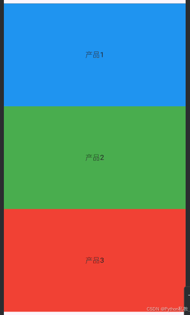
In this example, we’ve created a Column containing three Container widgets, each representing a product. The crossAxisAlignment is set to CrossAxisAlignment.start to align the children to the left.
在本例中,我们创建了一个“Column”,其中包含三个“Container”小部件,每个小部件代表一个产品。crossAxisAlignment被设置为crossAxisAlignment.start让孩子们向左对齐。
Run the App: Save your changes and run the app. You’ll see a vertically stacked list of colorful containers, simulating a product catalog.
运行应用程序:保存更改并运行应用程序。你会看到一个垂直堆叠的彩色容器列表,模拟产品目录。
Experiment and Customize
实验与定制
Feel free to customize the example by changing the colors, text, and dimensions of the containers. Additionally, you can explore other properties of the Column widget to further enhance your layout.
您可以随意通过更改容器的颜色、文本和尺寸来定制示例。此外,您还可以探索“Column”小部件的其他属性,以进一步增强布局。