鸿蒙UI(ArkUI-方舟UI框架)- 使用文本
返回主章节 → 鸿蒙UI(ArkUI-方舟UI框架)
文本使用
文本显示 (Text/Span)
Text是文本组件,通常用于展示用户视图,如显示文章的文字内容。Span则用于呈现显示行内文本。
创建文本
string字符串
Text("我是一段文本")

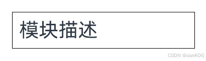
引用Resource资源
资源引用类型可以通过**$r**创建Resource类型对象,文件位置为/resources/base/element/string.json。
	Text($r('app.string.module_desc'))
	  .baselineOffset(0)
	  .fontSize(30)
	  .border({ width: 1 })
	  .padding(10)
	  .width(300)
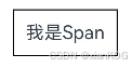
添加子组件
Span只能作为Text和RichEditor组件的子组件显示文本内容。可以在一个Text内添加多个Span来显示一段信息,例如产品说明书、承诺书等。
创建Span
Text('我是Text') {
  Span('我是Span')
}
.padding(10)
.borderWidth(1)
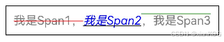
设置文本装饰线及颜色
通过decoration设置文本装饰线及颜色。
	Text() {
	  Span('我是Span1,').fontSize(16).fontColor(Color.Grey)
	    .decoration({ type: TextDecorationType.LineThrough, color: Color.Red })
	  Span('我是Span2').fontColor(Color.Blue).fontSize(16)
	    .fontStyle(FontStyle.Italic)
	    .decoration({ type: TextDecorationType.Underline, color: Color.Black })
	  Span(',我是Span3').fontSize(16).fontColor(Color.Grey)
	    .decoration({ type: TextDecorationType.Overline, color: Color.Green })
	}
	.borderWidth(1)
	.padding(10)
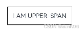
通过textCase设置文字一直保持大写或者小写状态。
	Text() {
	  Span('I am Upper-span').fontSize(12)
	    .textCase(TextCase.UpperCase)
	}
	.borderWidth(1)
	.padding(10)
添加事件
由于Span组件无尺寸信息,事件仅支持添加点击事件onClick。
	Text() {
	  Span('I am Upper-span').fontSize(12)
	    .textCase(TextCase.UpperCase)
	    .onClick(() => {
	      console.info('我是Span——onClick');
	    })
	}
自定义文本样式
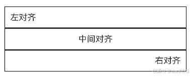
通过textAlign属性设置文本对齐样式。
	Text('左对齐')
	  .width(300)
	  .textAlign(TextAlign.Start)
	  .border({ width: 1 })
	  .padding(10)
	Text('中间对齐')
	  .width(300)
	  .textAlign(TextAlign.Center)
	  .border({ width: 1 })
	  .padding(10)
	Text('右对齐')
	  .width(300)
	  .textAlign(TextAlign.End)
	  .border({ width: 1 })
	  .padding(10)
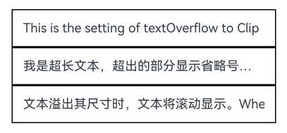
通过textOverflow属性控制文本超长处理,textOverflow需配合maxLines一起使用(默认情况下文本自动折行)。
	Text('This is the setting of textOverflow to Clip text content This is the setting of textOverflow to None text content. This is the setting of textOverflow to Clip text content This is the setting of textOverflow to None text content.')
	  .width(250)
	  .textOverflow({ overflow: TextOverflow.None })
	  .maxLines(1)
	  .fontSize(12)
	  .border({ width: 1 })
	  .padding(10)
	Text('我是超长文本,超出的部分显示省略号。I am an extra long text, with ellipses displayed for any excess。')
	  .width(250)
	  .textOverflow({ overflow: TextOverflow.Ellipsis })
	  .maxLines(1)
	  .fontSize(12)
	  .border({ width: 1 })
	  .padding(10)
	Text('当文本溢出其尺寸时,文本将滚动显示。When the text overflows its dimensions, the text will scroll for displaying.')
	  .width(250)
	  .textOverflow({ overflow: TextOverflow.MARQUEE })
	  .maxLines(1)
	  .fontSize(12)
	  .border({ width: 1 })
	  .padding(10)
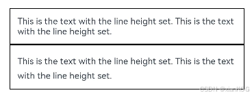
通过lineHeight属性设置文本行高。
	Text('This is the text with the line height set. This is the text with the line height set.')
	  .width(300).fontSize(12).border({ width: 1 }).padding(10)
	Text('This is the text with the line height set. This is the text with the line height set.')
	  .width(300).fontSize(12).border({ width: 1 }).padding(10)
	  .lineHeight(20)
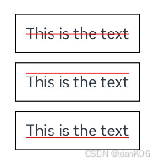
通过decoration属性设置文本装饰线样式及其颜色。
	Text('This is the text')
	  .decoration({
	    type: TextDecorationType.LineThrough,
	    color: Color.Red
	  })
	  .borderWidth(1).padding(10).margin(5)
	Text('This is the text')
	  .decoration({
	    type: TextDecorationType.Overline,
	    color: Color.Red
	  })
	  .borderWidth(1).padding(10).margin(5)
	Text('This is the text')
	  .decoration({
	    type: TextDecorationType.Underline,
	    color: Color.Red
	  })
	  .borderWidth(1).padding(10).margin(5)
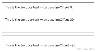
通过baselineOffset属性设置文本基线的偏移量。
	Text('This is the text content with baselineOffset 0.')
	  .baselineOffset(0)
	  .fontSize(12)
	  .border({ width: 1 })
	  .padding(10)
	  .width('100%')
	  .margin(5)
	Text('This is the text content with baselineOffset 30.')
	  .baselineOffset(30) //基线往上偏移
	  .fontSize(12)
	  .border({ width: 1 })
	  .padding(10)
	  .width('100%')
	  .margin(5)
	Text('This is the text content with baselineOffset -20.')
	  .baselineOffset(-20) //基线往下偏移
	  .fontSize(12)
	  .border({ width: 1 })
	  .padding(10)
	  .width('100%')
	  .margin(5)
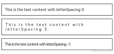
通过letterSpacing属性设置文本字符间距。
	Text('This is the text content with letterSpacing 0.')
	  .letterSpacing(0)
	  .fontSize(12)
	  .border({ width: 1 })
	  .padding(10)
	  .width('100%')
	  .margin(5)
	Text('This is the text content with letterSpacing 3.')
	  .letterSpacing(3) //字符间距变大
	  .fontSize(12)
	  .border({ width: 1 })
	  .padding(10)
	  .width('100%')
	  .margin(5)
	Text('This is the text content with letterSpacing -1.')
	  .letterSpacing(-1) //字符间距变小
	  .fontSize(12)
	  .border({ width: 1 })
	  .padding(10)
	  .width('100%')
	  .margin(5)
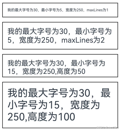
通过minFontSize与maxFontSize自适应字体大小。
minFontSize用于设置文本的最小显示字号,maxFontSize用于设置文本的最大显示字号。这两个属性必须同时设置才能生效,并且需要与maxLines属性或布局大小限制配合使用,单独设置任一属性将不会产生效果。
	Text('我的最大字号为30,最小字号为5,宽度为250,maxLines为1')
	  .width(250)
	  .maxLines(1)
	  .maxFontSize(30)
	  .minFontSize(5)
	  .border({ width: 1 })
	  .padding(10)
	  .margin(5)
	Text('我的最大字号为30,最小字号为5,宽度为250,maxLines为2')
	  .width(250)
	  .maxLines(2)
	  .maxFontSize(30)
	  .minFontSize(5)
	  .border({ width: 1 })
	  .padding(10)
	  .margin(5)
	Text('我的最大字号为30,最小字号为15,宽度为250,高度为50')
	  .width(250)
	  .height(50)
	  .maxFontSize(30)
	  .minFontSize(15)
	  .border({ width: 1 })
	  .padding(10)
	  .margin(5)
	Text('我的最大字号为30,最小字号为15,宽度为250,高度为100')
	  .width(250)
	  .height(100)
	  .maxFontSize(30)
	  .minFontSize(15)
	  .border({ width: 1 })
	  .padding(10)
	  .margin(5)
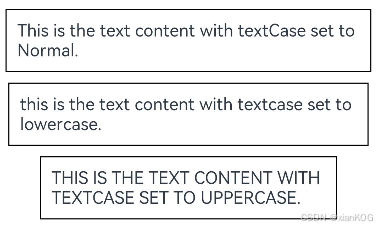
通过textCase属性设置文本大小写。
	Text('This is the text content with textCase set to Normal.')
	  .textCase(TextCase.Normal)
	  .padding(10)
	  .border({ width: 1 })
	  .padding(10)
	  .margin(5)
	// 文本全小写展示
	Text('This is the text content with textCase set to LowerCase.')
	  .textCase(TextCase.LowerCase)
	  .border({ width: 1 })
	  .padding(10)
	  .margin(5)
	// 文本全大写展示
	Text('This is the text content with textCase set to UpperCase.')
	  .textCase(TextCase.UpperCase)
	  .border({ width: 1 })
	  .padding(10)
	  .margin(5)
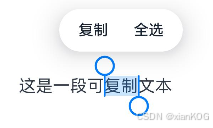
通过copyOption属性设置文本是否可复制粘贴。
	Text("这是一段可复制文本")
	  .fontSize(30)
	  .copyOption(CopyOptions.InApp)
添加事件
Text组件可以添加通用事件,可以绑定onClick、onTouch等事件来响应操作。
Text('点我')
  .onClick(() => {
      console.info('我是Text的点击响应事件');
   })
场景示例
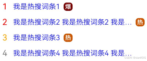
该示例通过maxLines、textOverflow、textAlign、constraintSize属性展示了热搜榜的效果。
// xxx.ets
@Entry
@Component
struct TextExample {
  build() {
    Column() {
      Row() {
        Text("1").fontSize(14).fontColor(Color.Red).margin({ left: 10, right: 10 })
        Text("我是热搜词条1")
          .fontSize(12)
          .fontColor(Color.Blue)
          .maxLines(1)
          .textOverflow({ overflow: TextOverflow.Ellipsis })
          .fontWeight(300)
        Text("爆")
          .margin({ left: 6 })
          .textAlign(TextAlign.Center)
          .fontSize(10)
          .fontColor(Color.White)
          .fontWeight(600)
          .backgroundColor(0x770100)
          .borderRadius(5)
          .width(15)
          .height(14)
      }.width('100%').margin(5)

      Row() {
        Text("2").fontSize(14).fontColor(Color.Red).margin({ left: 10, right: 10 })
        Text("我是热搜词条2 我是热搜词条2 我是热搜词条2 我是热搜词条2 我是热搜词条2")
          .fontSize(12)
          .fontColor(Color.Blue)
          .fontWeight(300)
          .constraintSize({ maxWidth: 200 })
          .maxLines(1)
          .textOverflow({ overflow: TextOverflow.Ellipsis })
        Text("热")
          .margin({ left: 6 })
          .textAlign(TextAlign.Center)
          .fontSize(10)
          .fontColor(Color.White)
          .fontWeight(600)
          .backgroundColor(0xCC5500)
          .borderRadius(5)
          .width(15)
          .height(14)
      }.width('100%').margin(5)

      Row() {
        Text("3").fontSize(14).fontColor(Color.Orange).margin({ left: 10, right: 10 })
        Text("我是热搜词条3")
          .fontSize(12)
          .fontColor(Color.Blue)
          .fontWeight(300)
          .maxLines(1)
          .constraintSize({ maxWidth: 200 })
          .textOverflow({ overflow: TextOverflow.Ellipsis })
        Text("热")
          .margin({ left: 6 })
          .textAlign(TextAlign.Center)
          .fontSize(10)
          .fontColor(Color.White)
          .fontWeight(600)
          .backgroundColor(0xCC5500)
          .borderRadius(5)
          .width(15)
          .height(14)
      }.width('100%').margin(5)

      Row() {
        Text("4").fontSize(14).fontColor(Color.Grey).margin({ left: 10, right: 10 })
        Text("我是热搜词条4 我是热搜词条4 我是热搜词条4 我是热搜词条4 我是热搜词条4")
          .fontSize(12)
          .fontColor(Color.Blue)
          .fontWeight(300)
          .constraintSize({ maxWidth: 200 })
          .maxLines(1)
          .textOverflow({ overflow: TextOverflow.Ellipsis })
      }.width('100%').margin(5)
    }.width('100%')
  }
}
文本输入 (TextInput/TextArea)
TextInput、TextArea是输入框组件,通常用于响应用户的输入操作,比如评论区的输入、聊天框的输入、表格的输入等,也可以结合其它组件构建功能页面,例如登录注册页面。具体用法请参考TextInput、TextArea。
创建输入框
设置输入框类型
自定义样式
添加事件
场景示例
富文本(RichEditor)
RichEditor是支持图文混排和文本交互式编辑的组件,通常用于响应用户对图文混合内容的输入操作,例如可以输入图文的评论区。具体用法参考RichEditor。