CSS综合案例4
CSS综合案例4
1. 综合案例
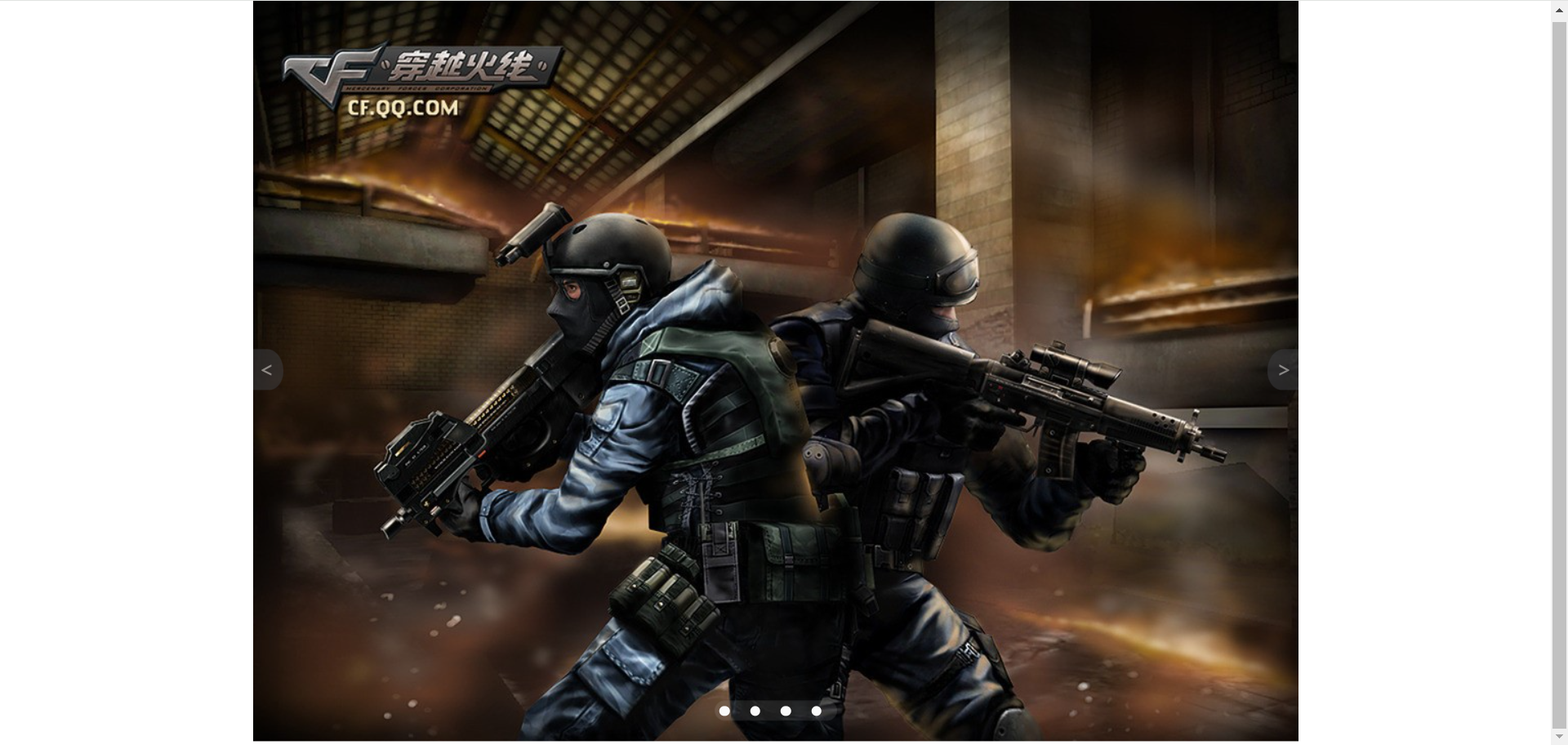
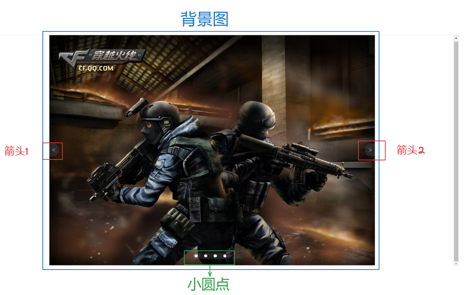
我们来做一个静态的轮播图。
2. 分析思路
- 首先需要加载一张背景图进去
- 需要4个小圆点,设置样式,并用定位和平移调整位置
- 添加两个箭头,也是需要用定位和位移进行调整位置
3. 代码演示
html文件
<!DOCTYPE html>
<html lang="en">
	<head>
		<meta charset="UTF-8" />
		<meta name="viewport" content="width=device-width, initial-scale=1.0" />
		<title>静态轮播图</title>
		<link rel="stylesheet" href="./style.css" />
	</head>
	<body>
		<div class="box">
			<img src="./R-C.jpg" alt="穿越火线" />
			<div class="arrow1">
				<p><</p>
			</div>
			<div class="arrow2">
				<p>></p>
			</div>
			<div class="Carousel"></div>
			<div class="wrapper">
				<div class="point"></div>
				<div class="point"></div>
				<div class="point"></div>
				<div class="point"></div>
			</div>
		</div>
	</body>
</html>
css文件
* {
	box-sizing: border-box;
}
.box {
	width: 1024px;
	height: 729px;
	position: absolute;
	left: 50%;
	top: 50%;
	/*translateX x轴位移,单位百分比或者px */
	transform: translate(-50%, -50%);
}

.arrow1 {
	width: 30px;
	height: 40px;
	background-color: #3e3f43;
	border-radius: 0 70% 60% 0;
	position: absolute;
	top: 50%;
	transform: translateY(-50%);
	opacity: 0.5;
	cursor: pointer;
}
.arrow2 {
	width: 30px;
	height: 40px;
	background-color: #3e3f43;
	border-radius: 70% 0 0 60%;
	position: absolute;
	top: 50%;
	left: 994px;
	transform: translateY(-50%);
	opacity: 0.5;
	cursor: pointer;
}

.arrow1 > p {
	position: absolute;
	left: 6px;
	top: -13px;
	font-size: 20px;
	color: #fff;
}
.arrow2 > p {
	position: absolute;
	left: 9px;
	top: -13px;
	font-size: 20px;
	color: #fff;
}
.Carousel {
	position: absolute;
	left: 50%;
	bottom: 20px;
	transform: translateX(-50%);
	width: 120px;
	height: 20px;
	border: 1px solid #ccc;
	background-color: #fff;
	border-radius: 20px;
	display: flex;
	align-items: center;
	justify-content: space-around;
	opacity: 0.1;
}

.point {
	left: 50%;
	bottom: 20px;
	transform: translateX(-50%);
	width: 10px;
	height: 10px;
	background-color: #fafafa;
	border-radius: 50%;
	cursor: pointer;
}
.wrapper {
	position: absolute;
	left: 50%;
	bottom: 20px;
	transform: translateX(-50%);
	width: 120px;
	height: 20px;
	border-radius: 20px;
	display: flex;
	align-items: center;
	justify-content: space-around;
}

.point:hover {
	background-color: #f55719;
}